
Wait, what just happenend?
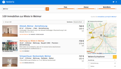
Big week this week - we rolled out the new design of Nestoria on the last countries, including the market I spend most of my time on Nestoria Deutschland.
Besides being a general refresh of the look and feel, we’ve changed the branding, moving away from the “house in nest” design my buddy Wayne from business school (as an aside, take that you clowns who claim MBAs never accomplish anything!) whipped up in about 10 minutes of photoshop back in 2006.

A quick survey of a few friend showed that people had a love / hate relationship with the logo. We went with it. I’m glad we didn’t spend more time on it. The advice someone with a lot of experience in consumer branding gave me at the time was “just name sure the name is easily readable and pronounceable, nothing else matters”. That advice made sense to me, and so we moved on to the next problem. Good enough is often … good enough.
But as time marched on, our look began to feel increasingly dated, and didn’t always work well on new platforms. It was time for a refresh, and we used the chance to make nestoria even simpler and cleaner. It’s funny, at every stage we’ve always been proud of how simple we make the service, and yet later when we look back we realize there were so many pieces we didn’t need. One thing the team decided we could do without was a complicated logo. By complicated I mean multiple shdes of blue, and little twigs sticking out of the nest to catch your eye on. And so we arrive at our new logo:

Savio was the main man on the keyboard on this project, and he gave a great talk of some of the technical challenges. As ever - building something simple is, to be blunt, very fucking hard. It’s very easy to underestimate the challenge of making a template that is easy to maintain, easy to expand upon, and works with the different requirements of many different real estate markets around the world.
Great work to everyone in the team who pulled this project across the finish line, but especially Savio, Vuk, and super-intern Sunil. There’s lots to be proud of on this project, but for me the thing I’m most pleased with is that I had literally nothing to do with it. I found out about the new logo only long after it was decided and we were well down the path to implementation. Nestoria has moved from fragile start-up to well tuned machine that keeps on cruising without my hands on the wheel. I love it.
Please take the new look for a spin in the country of your choice and let the team (ie not me) know what you think. How can we make it even simpler?